By Lauren Smith
There's a reason people say trends always come back in style— it's true. Case in point: kelly green, harvest gold and dusty rose, which might remind you of your grandma's house, are popping up in interiors everywhere these days. And if you ask us (and these fabulous designers), that's a great thing!
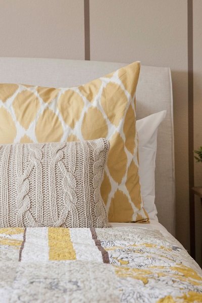
1. Harvest Gold
"The colors of my childhood in the 1970s are making a comeback, which were proudly autumnal, like harvest gold," said designer
Scot Meacham Wood. "This time around, the color feels a bit more muted and subtle- not nearly as brash as my childhood!" This shade is also similar to the trendy marigold.
 Getty Images
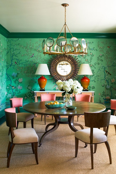
2. Kelly Green
"We are happy to see a range of greens come back, including whimsical kelly green," said designer Gideon Mendelson of
Mendelson Group. He embraces the playfulness of the color in this dining room, which was inspired by his client's love of Lily Pulitzer prints.
 Eric Piasecki
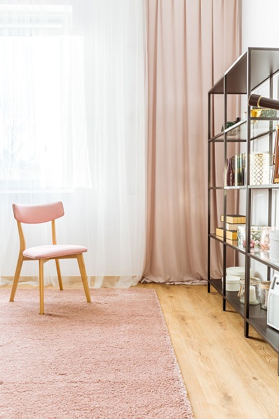
3. Dusty Rose
Don't confuse this hue with Millennial pink— it's softer and more muted. "The color has a very '50s and '60s vibe, and reminds me of my grandmother's bathroom," said designer
Brooke Lang. "In the modern design, you can play it up with charcoal gray and crystals."
 Getty Images
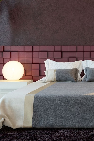
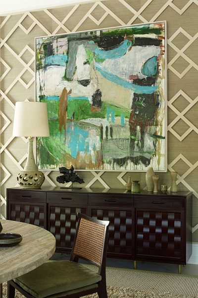
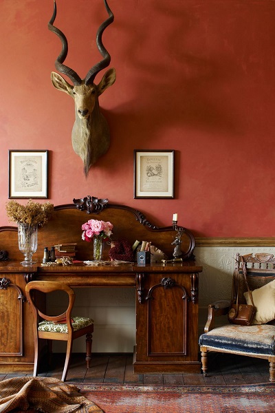
4. Dark Burgundy
"This tone has always been associated with opulent interiors, however in 2018, it can also inject a playful sophistication within a space," said Ana Cummings of
ANA Interiors. She recommends pairing it with gold metallics.
 Getty Images
5. Mint
"To make mint more formal, try upholstering a chair in a mint textile or using it as an accent pillow on a white or soft gray couch," said Kayla Hein, creative director at Modern Castle.
 Getty Images
6. Olive Green
The title of neautral isn't just reserved for white and beige anymore. "This color is a different kind of neutral with sophistication and depth, and can be paired with anything," said Mendelson. "It has a sophistication that's ideal for millwork and trim." And this dining room is proof.
 Tria Giovan
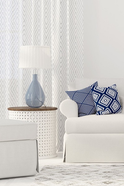
7. Classic Blue
"There is a return to certain classics like blue paired with white which is always perfect, whether it's in a formal setting with pops of strong color or a casual setting with ticking stripes," said designer
Lisa Melone Cloughen. She notes her clients are asking for these colors in plush fabrics in particular.
 Getty Images
8. Classic Red
"A lot of people confuse red with being stressful, but if put in the right place, it's stimulating, especially in a social area where you want to keep the energy and conversation going," said designer and author,
Bea Pila. In an office, this shade will help you stay inspired throughout the day.
 Getty Images
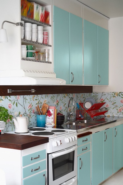
9. Teal
When painted on kitchen cabinets, this color will immediately transport you back to the 1950s. "In its origin, teal was never my favorite color, because it lacked depth, but now there are such beautiful tones that resemble more gemstone quality colors," said designer
Jillian O'Neill.
 Getty Images
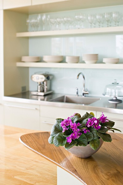
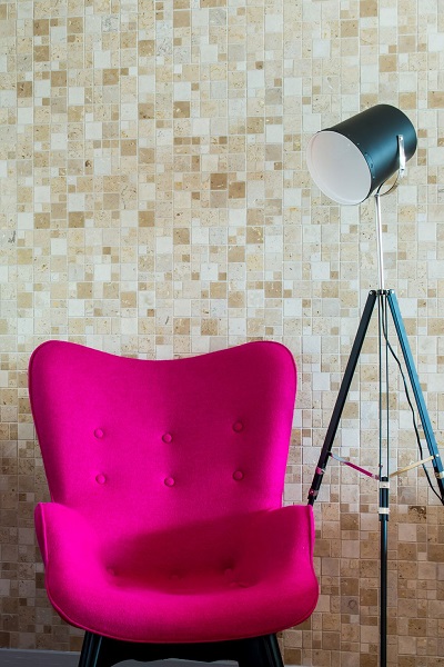
10. Magenta
Magenta isn't just a reminder of the '60s anymore. "This color is bold and bright and would make for a great accent wall or unique upholsted piece of furniture," said Hein. She recommends pairing it with bold dark and white stripes to play ip up or a more neutral cream palette to play it down.
 Getty Images
This article,
10 Retro Colors Designers Say Are Making a Huge Comeback, originally appeared on
House Beautiful.